ShopDreamUp AI ArtDreamUp
Deviation Actions


Suggested Deviants


Suggested Collections


You Might Like…


Description
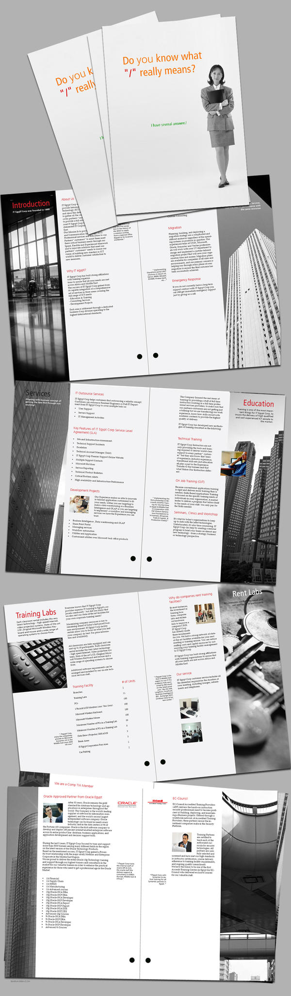
2007, for itegypt
I have problem here, when I resized the pages to make the presentation file, I found the final image is a bit pixlated. I think it has a problem with the re sample model. I know I should park it until I can make it better, but really if I did, I would submit it next year.
So I will keep it that way until another time to review it.
I tried to make the grid system detailed, Type faces: Fruitger and Palatino.
Thanks for Hussein for helping!
Image size
1024x3500px 1.2 MB
© 2008 - 2024 shawkash
Comments34
Join the community to add your comment. Already a deviant? Log In
I love the cover's simple design though red, orange and green dun match together (too much for the eye), you could pick only 2 colors for fonts, like red and black, orange and black or green and black, lets say red and black, as it's the color of headings in the rest of brochure.
in "Education" page, the picture is a bit drifted right. i dunno it kinda made me feel uncomfortable to see the background incomplete.
I agree with Humshriber, it is a very neat design, and highly professional.
- ghu
in "Education" page, the picture is a bit drifted right. i dunno it kinda made me feel uncomfortable to see the background incomplete.
I agree with Humshriber, it is a very neat design, and highly professional.
- ghu